| Building a tool to demystify internet speed
Internet, you
will save us
How I rebuilt Centerfield’s flagship brand’s legacy tool to become an unlikely hero for the masses in the midst of COVID-19.
My Role:
Senior Product Designer
Stakeholders:
Director of Product
Director of SEO
Timeline:
6 weeks
Team:
Product Manager, SEO
Developer, SEO
🦠
It's March 2020 and with no other option, we, as a world, asked the internet to hold our entire lives— but with this sudden demand for bandwidth, so began buffering, dropped calls, and heavy lagging.
Few people knew why, but they knew they needed a change.
BroadbandNow is Centerfield’s flagship brand that has millions of annual visitors.
It helps those visitors find internet providers and plans.
01.
For these new pandemic-induced internet shoppers, we already had a tool to help them learn what internet speed they would need, except—
It had…
1. Outdated UI
Users reported feeling a lack of trust in the tool as a result of the interface.
2. Heavy Cognitive Load
The tool demands more brainpower than it offers value.
3. Flawed Technical UX
The flow was over-capturing data that became irrelevant
4. A Lack of Empathy
The tool never considers what a user's priorities are.
5. Misleading System States
A response for every input created unnecessary, and confusing, guidelines.
Out of 140k people using the tool
just 2.6% of users
would navigate from there to a page that included internet providers or plans to shop— squandering the revenue opportunity.
02.
Users needed a fast, easy-to-understand product to identify how their lifestyle and priorities determined what speed they needed.
To get started, I looked backwards—
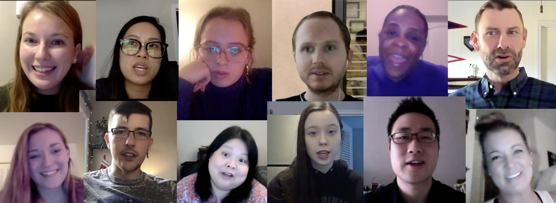
In Q4 2020, I independently conducted a 5-week, mixed method user research study to understand how people shopped for home services.
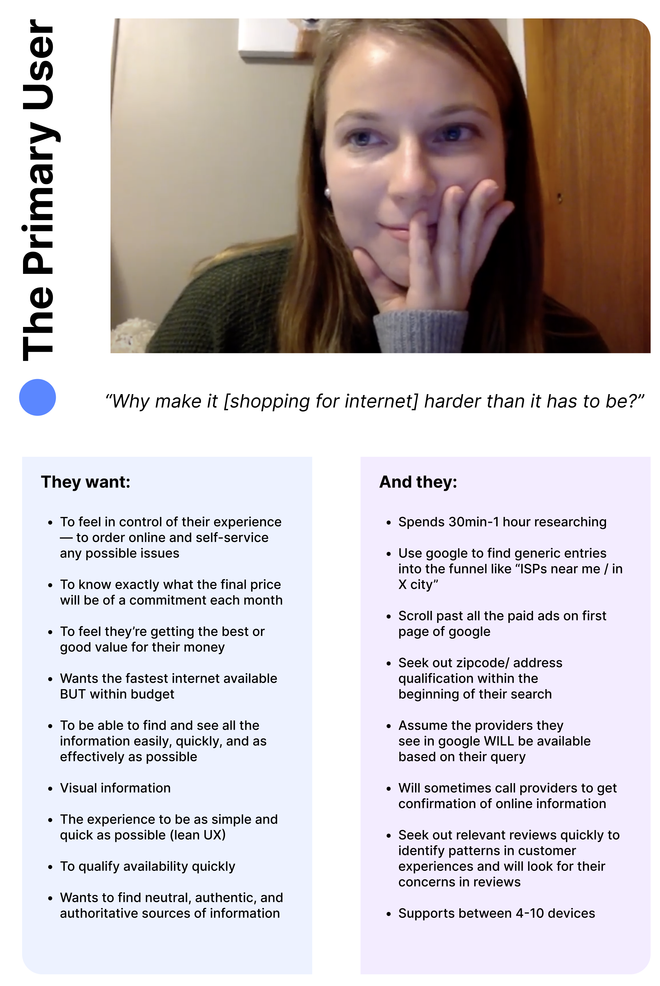
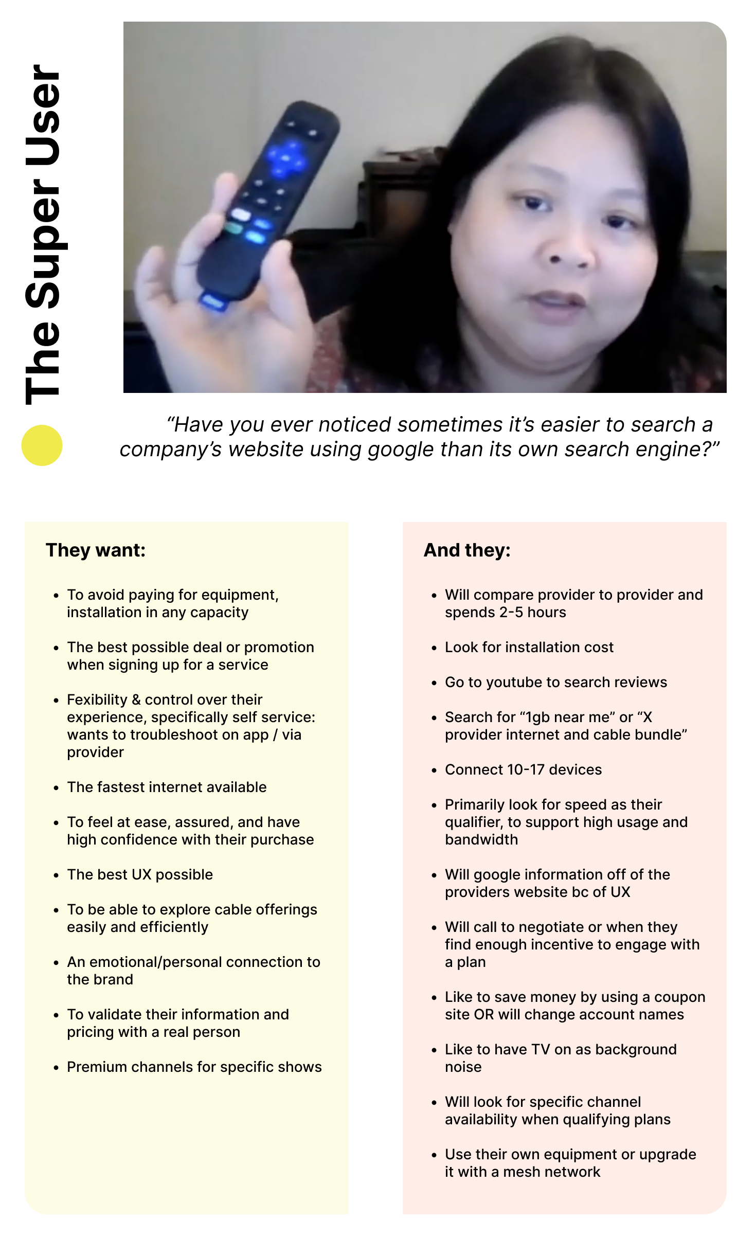
I delivered a 40-slide deck and statistically significant personas:
These users’ goals and behaviors shaped the way I considered how to rebuild the tool:
⏲️
Make it snappy
Our primary shopper wanted to spend as little time as possible to identify what they needed and acquiring it.
Instant Gratification
🫴🏽
Both users want us to give precise recommendations that only included what would be confirmed available to them.
😩
English, please.
Our primary user wanted easy-to-understand syntax, not the technical language our super users have taught themselves.
⚖️
Understand the priority
These users have clear driving forces to what is the most important facet of an internet plan, it was key to know what they valued.
03.
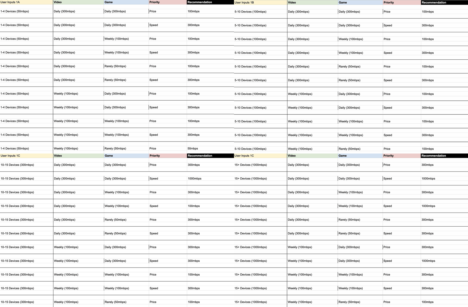
I then interviewed multiple internet experts to understand how various devices and activities were measured in weight against the MBPS they would need to be optimally supported to create the tool’s logic matrix.
To stay within scope, I oriented the speed vs. use logic to align to the most popular plans’ typical speed offerings.
04.
Soon, the flow’s first draft was born:
Click to enlarge
The bedrock of this proposed flow was a plan shopping page that didn’t exist prior to a UX audit I conducted.
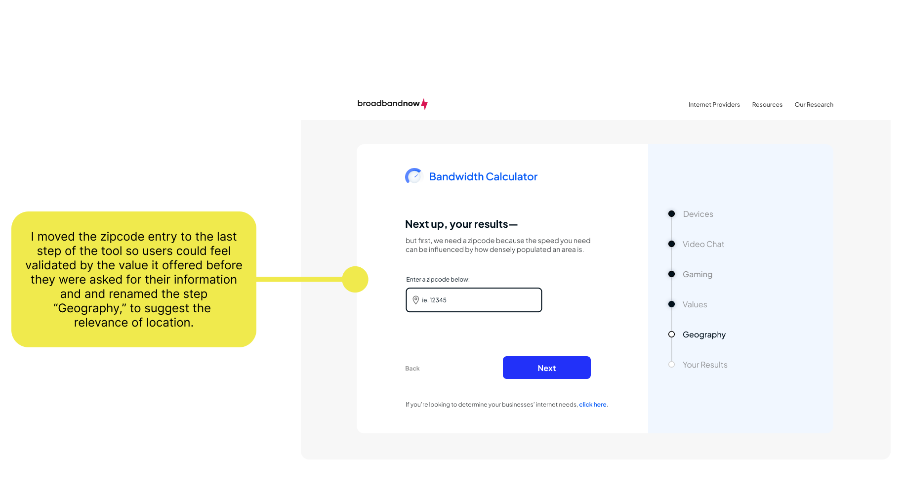
But, a delay in development meant that that page would not be ready in time for this tool, so, I had to pivot the experience:
Click to enlarge
The adapted flow now focused on introducing shoppable provider cards that matched to the user’s recommended speed at the end of the tool.


